Final design
I chose this solution because:
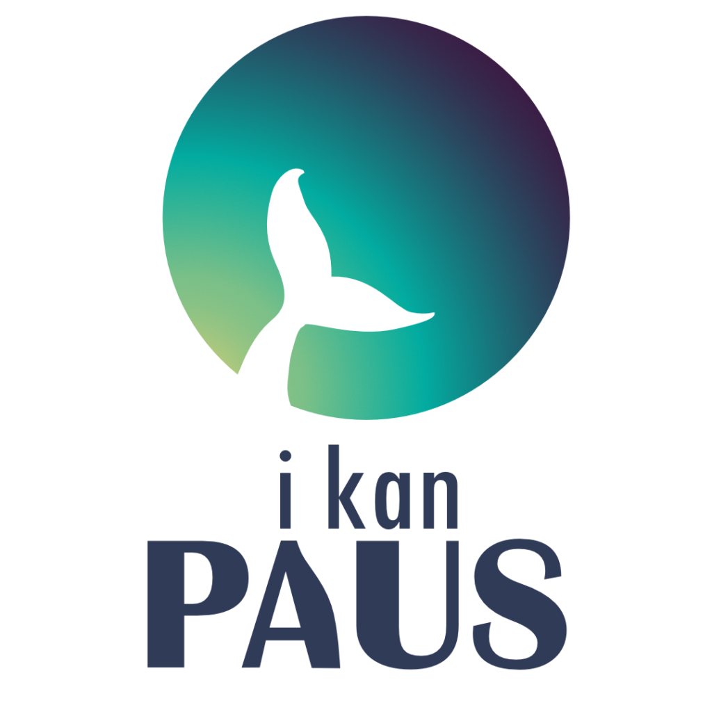
- A whale’s fin only emerges in matriarchal pods
- U.S. based company so reading from left to right
- Colors akin to travel-industry beach colors for hope, reassurance, optimism
- Ends with a deep color because whales go deep
- Primary color similar to Sri Lankan flag color for the founder’s roots
- Britannica Bold chosen as an shift from U.S. society that encourages women to be small, to a bolder version of a woman beyond simple adherence to societal norms.

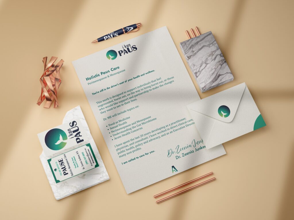


Go-to-market assets: the approach
A resilient brand is built from the inside out. The process began by alignment on long-term vision, followed by deep research to find the brand’s unique positioning in a crowded market.
Brand strategy workshop
Before designing, we defined Where are you now, where do you want to be, and how will your brand grow with you. These sessions were highly collaborative rather than the passive presentation model.
Method
These sessions were part education of what a brand ecosystem principles, part done-with-you interactive workbooks.
Outcome
The completed workbooks provided insights that informed my research and analysis.
Competitive analysis
Using the workbook as a foundation, I dug deeper and made unlikely connections.
For I kan PAUS, the competitive analysis revealed a distinct gap in the market. Instead of leaning into authoritative, clinical, traditional aesthetics, we reframed the vision: I imagined a brand that maintains its core focus on middle of life wellness while keeping the range, relevance, and vitality needed to reduce women’s health stigma for younger audiences.
The Impact
“She was a pleasure to work with 💜” – Dr. Zeenia Junkeer
“I would love a program like this” – market research interviewee